

Eko Jeun Mobile App
Recognizing the challenges faced by Lagos’ working professionals in restaurant payment processes, I designed Eko Jeun, a food ordering app with an integrated wallet system. This solution enables users to pre-book and pay for dine-ins and take-outs, eliminating time wasted on placing orders and making payments.
Duration
4 months
My Role
UX and Brand Designer
Skills
User Research, UX Writing, Branding, Wireframing, Prototyping, Testing
Background
Many working-class people in the city of Lagos spend at least a day a week at their favourite restaurant. This activity is sometimes spoiled by delays or embarrassment associated with card transaction errors. Therefore, I wanted to design a solution that will tackle this problem. I carried out interviews to understand the users’ pain points better and define our main target users and features.

My understanding of the problem
I started my research by conducting interviews with young, tech-savvy, working-class individuals who visited restaurants at least once a week. Before conducting the research, I had the assumption that people were having challenges with making payments at restaurants. It was a relatable problem. The goal of my interview was to identify pain points that users experience when making payments at restaurants.

“As a busy professional, I want to avoid delays at restaurants so I can maximize my time”

Competitive analysis
In order to build a foundation for Eko Jeun, I had to study what other major competitors were already doing and what user goals they were not reaching. I found that none of the apps had a Dine-in option or Wallet feature.

Conceptualizing the solution

Storyboards
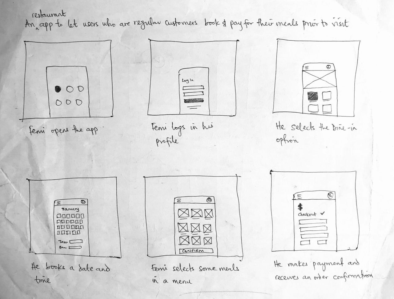

Two main features
Wallet feature:
The user will be able to credit his wallet in-app using a debit card at any time and make payments for his meals whether at the restaurant or before his visit. This helps to eliminate embarrassment and time wasted making payments at restaurants.
Dine-in booking feature:
Users will be able to make dine-in reservations—a feature that is useful for restaurants that are regularly packed out.
Usability testing
I conducted a moderated usability study to evaluate the ease of use of the low-fidelity prototype and identify areas for improvement. Using an affinity map, I was able to group the feedback and see areas in the design that needed to be reviewed.
Firstly, the homepage was simplified to show the user a Categories section, Top recommendations and Recent visits. The option of Dine-in, Takeout and Delivery were moved to later in the flow. Favourites was added to the bottom navigation bar and the option to save debit card was introduced.


Branding & style guide


High-fidelity prototype
I came up with a user flow diagram to have a bird’s eye view of the design. It highlights the key features of the app and the flow from start to order completion.


Dark mode exploration
I also set out to explore a dark UI mode for the app due to its aesthetics and accessibility advantages.

Learning points

Through direct interviews with the target audience, I identified specific pain points in restaurant payment processes. This insight led to the design of an integrated wallet system, underscoring the importance of grounding design solutions in actual user needs.
Applying a structured design thinking approach facilitated a comprehensive understanding of the problem space, leading to effective ideation and prototyping phases.