

Upskillable SaaS & Brand Design
As Product Design Lead, I led the redesign of Upskillable employee development SaaS platform to enhance the platform’s usability and market positioning, aligning with Saudi Arabia’s Vision 2030 workforce development goals.
400%
Increase in sign ups
1400+
Assessments completed
Duration
8 months
My Role
Lead Product and Brand Designer
Team
Dubem Okonkwo, Wiem Jdidi, Maymouna Aldabobi
Skills
User research, Product strategy, Stakeholder engagement, Design System, Copywriting, Prototyping, Usability testing
Background
Saudi Arabia’s Vision 2030 aims to tackle workforce challenges through employee training. Our goal was to reposition Upskillable in the market and make it profitable.
Despite pressure for a quick design and resource constraint, I championed a user-centered approach. I outlined a new product strategy with a 6-step action plan for the team
User research
Establish brand identity
Iterative testing & feedback
Defining pricing strategy
Website & app redesign
Agile dev. collaboration

Our understanding of the problem
Validated assumptions
Companies in Saudi Arabia are focused on employee development
These companies need to carry out employee assessment
They will pay for a digital solution that caters to these needs
Employees are intrigued to know about their soft skills and how to develop them
To validate stakeholder assumptions and gain firsthand insights, we conducted 45-60 minute interviews with HR and L&D Managers to understand how they assess employees and determine training needs.
Recognizing a lack of shared understanding of our users, we also created personas—The HR Manager (Primary User) and The Employee—to establish a clear reference point for design decisions.

Who are our competitors?
We did some research with the marketing team to know what other assessment platforms were doing. We found out that most were more focused on hiring than employee assessment and development. Our value proposition lies in the latter.

Global. Psychometric assessments not tied to the workplace
Assessments only for hiring. Not offered in Arabic


Big impact in the region. Do not offer personalized learning plans
Assessments only for hiring. Not offered in Arabic
Establish a cohesive visual identity
Considering user feedback, we addressed pronunciation challenges faced by Saudi nationals through a visual redesign. This involved dividing the name “Upskillable” into two sections for improved readability and memorability, using weight and color for distinction.


Website redesign for lead generation
With a renewed understanding of our users and the problem we aimed to solve, we proceeded with the website redesign.
A key consideration—and a unique challenge—was ensuring the design seamlessly accommodated both English and Arabic translations, requiring thoughtful adjustments for Right-to-Left (RTL) compatibility and linguistic nuances.
English

Arabic


App redesign
“We had a lot of support calls because users weren’t sure how to use the platform. There was a lot of clutter. Our developers and support were doing a ton of work”
Redesign components and align with refined brand identity
Streamline the user flow for easy self-management
Streamline features through prioritization
Add a Freemium pathway to reduce time to value, and monetize a Premium plan


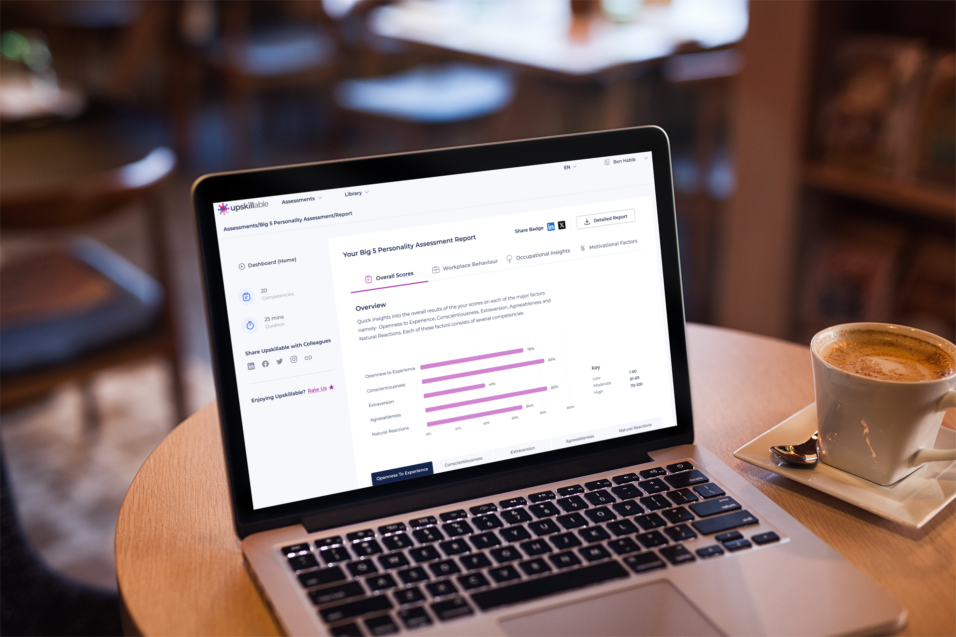
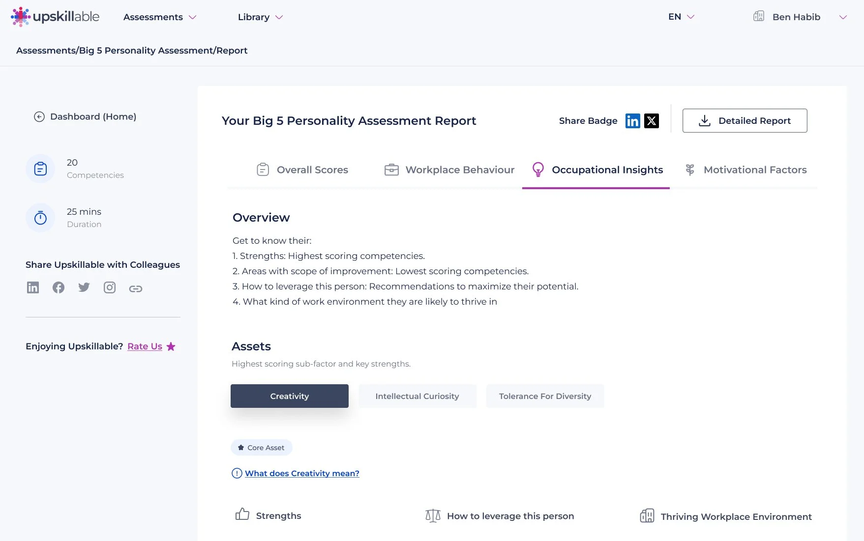
A more intuitive report dashboard
To enhance the Upskillable dashboard's usability, we prioritized presenting key insights prominently, reserving detailed information for a downloadable PDF. This approach minimized on-screen clutter, facilitating quick comprehension of essential data.
We also employed tabs, infographics, and tables to organize information intuitively, ensuring users could navigate the dashboard with ease.


Minimizing Cognitive Load to Accelerate Time to Value
By eliminating distractions throughout the user journey—from website navigation and sign-up to assessment sharing and report viewing—we ensured users remained focused on their tasks, thereby minimizing time to value.
This streamlined approach reduced cognitive load, allowing users to achieve their objectives more efficiently.
Usability testing

We tested the platform to ensure usability. 3 out of 4 participants had trouble understanding how the free credits will be used and applied
Providing clear instructions and benefits of these credits upon registration is essential for better UX. Hence, we decided to add a popup as they land on the platform after sign up/login

The impact

400%
Increase in sign ups
1400+
Assessments completed
More aligned team
Solid product strategy for scaling
Potential to compete effectively in the market
Challenges
With a renewed understanding of our users and the problem we aimed to solve, we proceeded with the website redesign.
A key consideration—and a unique challenge—was ensuring the design seamlessly accommodated both English and Arabic translations, requiring thoughtful adjustments for Right-to-Left (RTL) compatibility and linguistic nuances.
Foregone alternatives
Before I was assigned the role, I was tasked with redesigning the dashboard with a focus on the individual user whose goal is to develop professionally and secure employment. My initial brainstorming allowed for a wide range of potential features.
However, due to resource limitations, the necessity for a thorough understanding of user needs, and our commitment to a lean process, we ultimately chose a more focused approach. This shift in direction enabled us to prioritize the most impactful functionalities that align with user objectives, leading to a more streamlined product.
